Internal · Design System
Elements.
A live reference of every typographic, button, form, image and colour primitive used across Mount Iron. Use this page when planning new content or evaluating consistency.
01 · Typography
Headings & text.
Display headings use Berlingske Serif. Body, eyebrows and UI use Google Sans Flex. All scales are responsive.
heading-display
Serif · light/normal · text-4xl → 7xl · leading 1.05 · tight tracking
Effortless ownership, defined by design.
heading-xl · h1
Serif · text-3xl → 6xl · leading 1.1
Architecture in harmony with the landscape.
heading-lg · h2
Serif · text-3xl → 5xl · leading 1.15
Two architectural typologies, one alpine vision.
heading-md · h3
Serif · text-2xl → 3xl · leading-tight · normal weight
The Townhouses
heading-sm · h4
Sans · text-xl → 2xl · medium · tracking tight
North-facing sanctuaries
h5
Sans · text-lg · semibold
Wellness spaces and adventure-ready storage
h6
Sans · text-base · semibold
Concierge services available daily
.eyebrow
Sans · text-xs → sm · medium · 0.2em tracking · uppercase · primary-500
The Collection · A limited release
Lead paragraph
Sans · text-lg → xl · light · relaxed line-height · secondary-400
A limited release of residences offering a new standard of alpine living, anchored by world-class hospitality and a vitality-led wellness programme.
Body
Sans · text-base/[17px] · light · relaxed · secondary-400
The Collection at Mount Iron represents a unique evolution in New Zealand property. Comprising 26 meticulously crafted townhouses and 23 executive apartments, each residence is designed to maximise the light and drama of the Upper Clutha Basin.
Small text · captions
text-sm · text-xs · font-light · secondary-400
text-sm — for figure captions, meta info, fine print.
text-xs — for legal lines, footnotes, microcopy.
Inline elements
Links, bold, italic, code inside body copy.
Mount Iron is a master-planned sanctuary where design, ecology and hospitality converge. Read more about the ownership advantage or browse the /collection.
02 · Buttons
Variants & sizes.
Five variants, three sizes. All buttons use the _button.antlers.html partial. Hover/focus states are interactive — hover any button to see them.
Default size (md)
Sizes — primary variant
Notes: All buttons render as anchor tags via the partial. Pass :url, :text, :variant, :size, :new_window.
03 · Form Fields
Inputs & states.
Form fields use the form-block__* classes. Below is each input type alongside its label, error state, and submit affordance.
Please correct the following:
- Email is required.
- Phone must be a valid number.
04 · Images
Aspect ratios.
Standard aspect ratios used across blocks. Pair with object-cover and a background fill so partially-loaded images don't ghost.
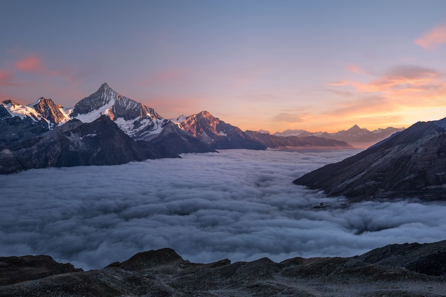
1 : 1 · aspect-square
Gallery, logo cloud, avatars.
4 : 3 · aspect-[4/3]
Image+Text block, landscape gallery.
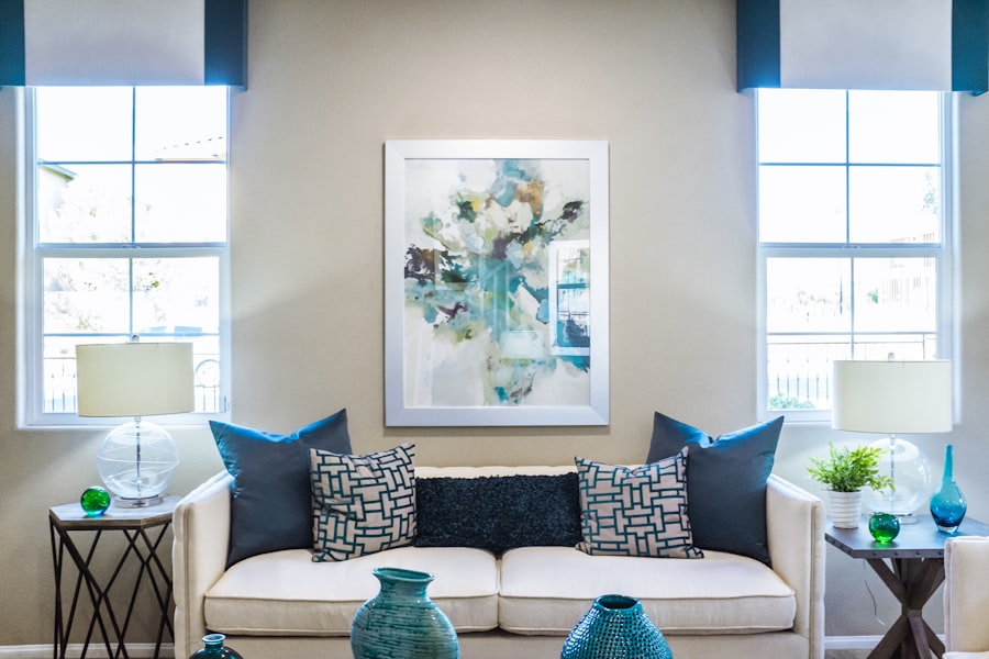
4 : 5 · aspect-[4/5]
Image card style (cards_grid).
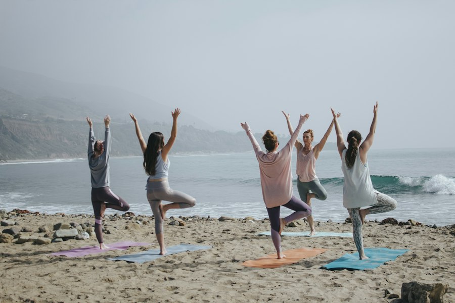
3 : 4 · aspect-[3/4]
Portrait gallery.
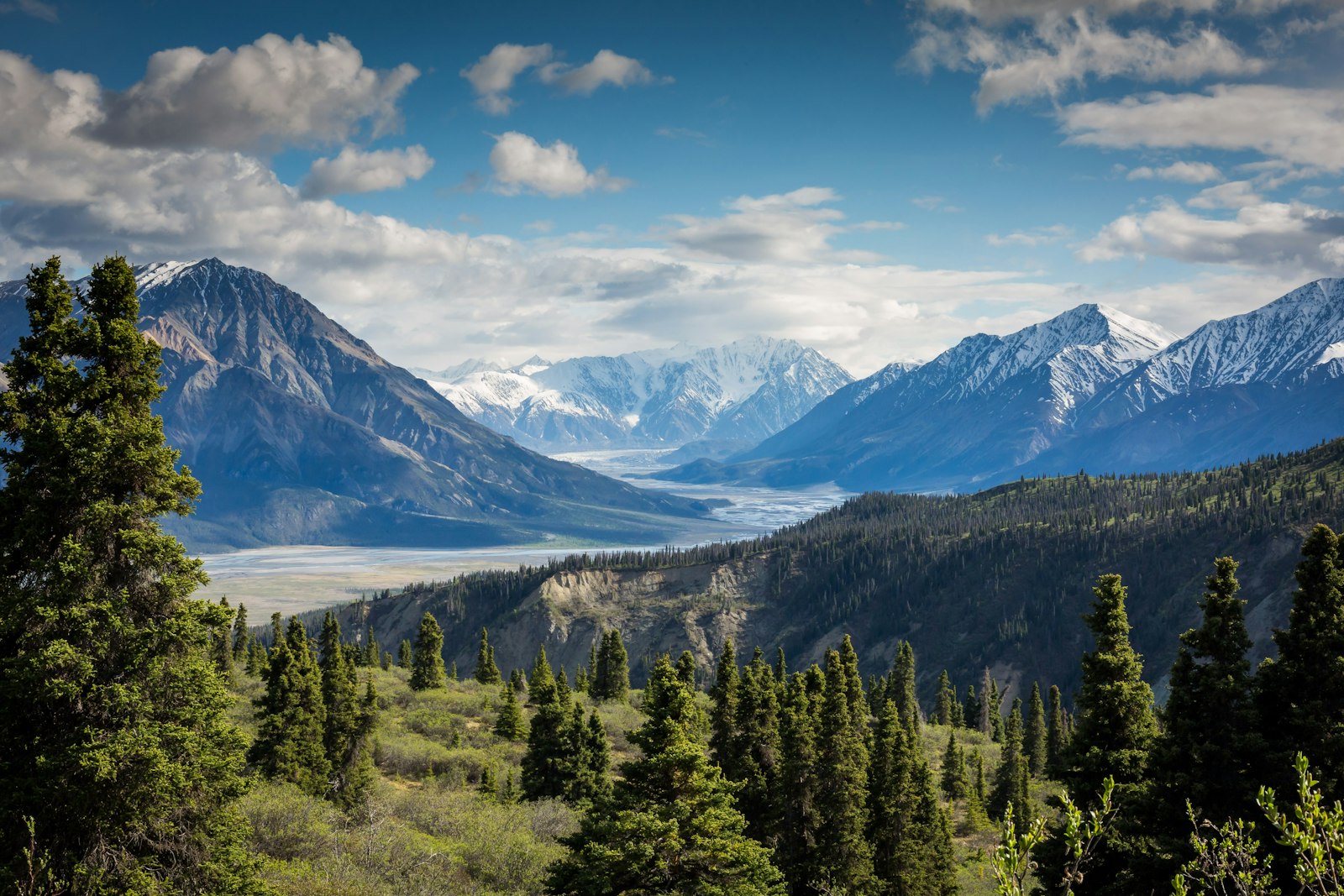
16 : 9 · aspect-video
Video block, cinematic banners.
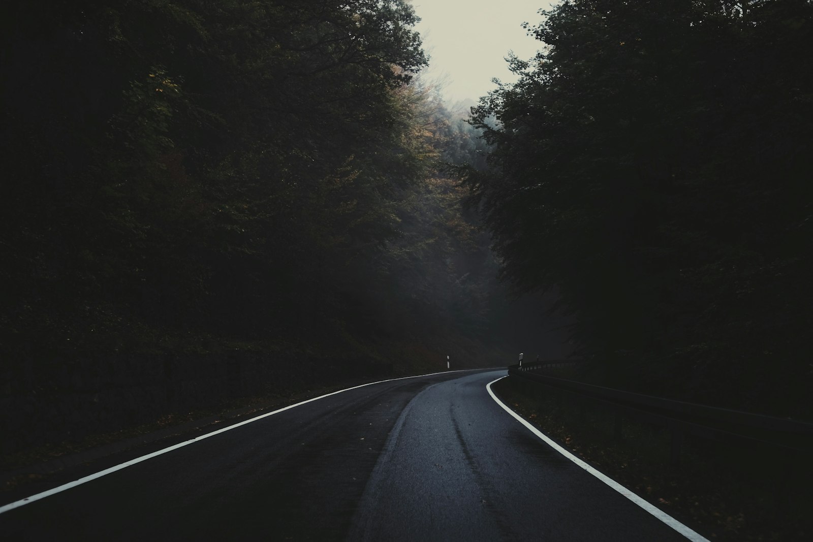
21 : 9 · aspect-[21/9]
Cinematic hero banners (rare).
05 · Colour
Palette.
Each ramp is registered as Tailwind utilities (bg-primary-500, text-secondary-500) and as CSS variables (--color-primary-500).
Primary · Bronze
primary-50 → 950
#faf5f0
#f2e7d9
#e6cfb3
#CE8E5C
#B07242
#945D32
#7a4b27
#5d381d
#412714
#29180c
#150c06
Secondary · Deep Teal
secondary-50 → 950
#f0f7f9
#d5e9ec
#a8d3d9
#176A72
#0D4E59
#063844
#052b34
#031e25
#021318
#01090b
#000506
Accent · Deep Forest
accent-50 → 950
#e6f4ec
#c2e3cd
#84c69b
#45a86a
#178746
#014421
#013818
#002c13
#00200e
#001508
#000a04
Neutral · Brand Gray
neutral-50 → 950
#fafafa
#f5f5f5
#EDEDED
#d4d4d4
#a3a3a3
#737373
#525252
#404040
#262626
#171717
#0a0a0a
Light & Dark · single tokens
--color-light · --color-dark
#F5FAFB
#1A1A1A
Semantic
success · warning · error · info
#22c55e
#f59e0b
#ef4444
#3b82f6
Reference
That's the system.
Pair this with /blocks-showcase for composed components built from these primitives.